GENOS BACKGROUND
Complete Genomics is a company that provides human genome sequencing. Universal Mind originally engaged Complete Genomics to build out an interface that allows genetic researchers to visualize and annotate their findings. They realized that much of the technology used to power this researcher offering could power the back-end of a consumer product as well, and so Complete Genomics partnered with Universal Mind to build Genos: a next generation genetic insight platform for consumers similar to 23andMe or Ancestry.com.
The platform allows users to get sequenced, explore their genetic data, share that data with friends, and engage with researchers. Genos consists of 5 core areas: Traits, Ancestry, the Explorer, Conditions, and Drug Response.
Genos sets itself apart from competition through simplicity, data privacy, data portability, and ability to sequence your whole genome. Competitors only sequence part of the genome (specifically the “exome”) and sell the user’s genome to researchers themselves; On Genos customers own their genetic data, choose for themselves whether to license it out, and benefit from research if they do both financially and by getting personal reports on the latest findings their information helped to uncover.
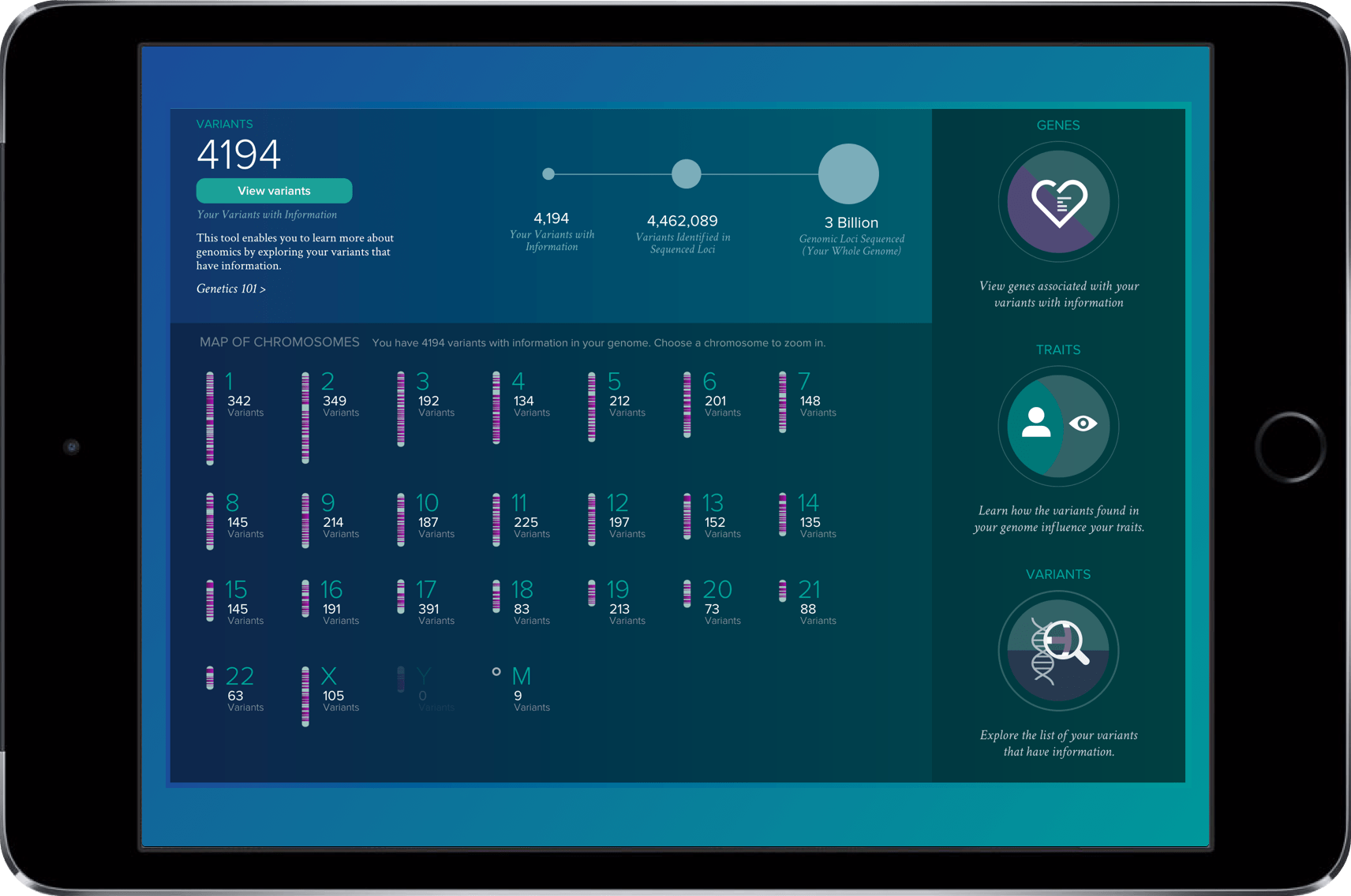
My role on this project started as a front end developer and UX specialist, but over time grew into UX team lead.
BUSINESS CHALLENGE
Complete Genomics Partnered with Universal Mind and Frog Design to build out a consumer portal that would allow regular folks to visualize and understand the information locked in their DNA through a new SAAS product called “Genos”
Genetic research is a young and fairly weak science. During the project competitors were shut down, and the whole space was at risk for government investigation for over-promising on uncertain correlations between specific genetic conditions and a person’s DNA. Universal Mind had to navigate these complications and provide value to both Complete Genomics and the user in this design.
Genomics is Confusing.
I get it — genomics is a relatively new science, and most people haven’t reviewed ”genetics 101” since high school biology.
Our challenge in this application was to make genetic information accessible, educational and intuitive. frog design had the task of designing out the user’s landing page and Universal Mind got to tackle the “Genome Explorer”, where the user could get deep into the weeds of their genetic data.
We were instructed not to pull any punches — prior research had shown that there was a place in the market for a detailed and advanced personal genome exploration project, and that’s what our stakeholders intended Genos to become.
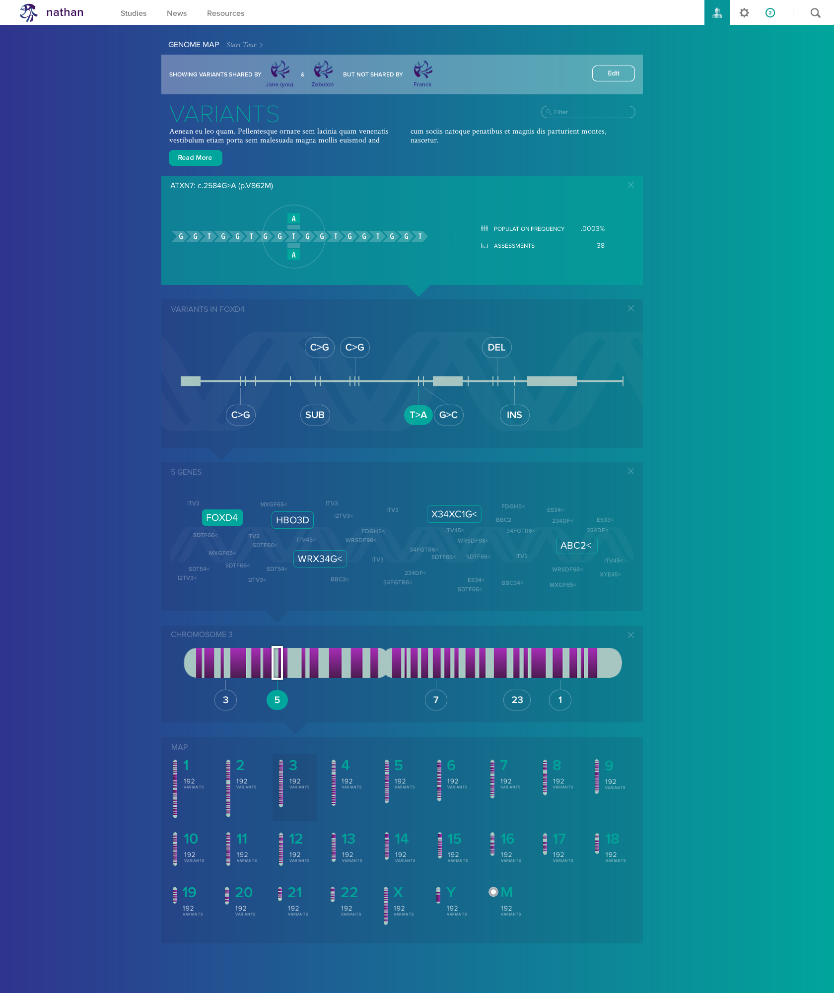
Giving Context
DNA consists of 3 billion base pairs which reside in 23 pairs of chromosomes. This is a lot of data to expose to a user at a single point in time. To help users understand how chromosomes, genes, and DNA all relate, the explorer uses HTML5 and CSS3 animation and transformation to walk a user through their genome and explain each step along the way from their full genome down to a single base-pair of DNA.
KAROGRAM AND DETAILS
As users explore their way through the genome they can transition at any time between the highly-visual “explorer” mode and more structured “detail” pages that read a bit more like text books and give more detailed information.
From the detail page a user has the ability to see how any piece of genetic information influences their body, the latest research, or what others in the community with similar traits are experiencing.
One of our biggest design challenges was helping the user maintain context during the switch between the “explorer” and “detail” modes. To accomplish this we again relied on finely-tuned in-browser animation to help the user understand how an object in one mode transitioned into the other. We wireframed each state of these animations and had the design and development teams work together closely to ensure we got it right.
Good UX design helps a user make sense of complicated information without undermining the complexity or losing any of the information.
Simplifying the complex
To help users unfamiliar with genetics make sense of the interface and learn the terminology we built a first time user “tour” through the system.
Before taking the tour very far we knew we needed some feedback from our users. Was this the right way to help them understand the system? Would any of them even notice that the tour was available?
To answer these questions, the tour was quickly prototyped using rough grayscale windows (shown here) and tested with folks in the target demographic over a period of two days.
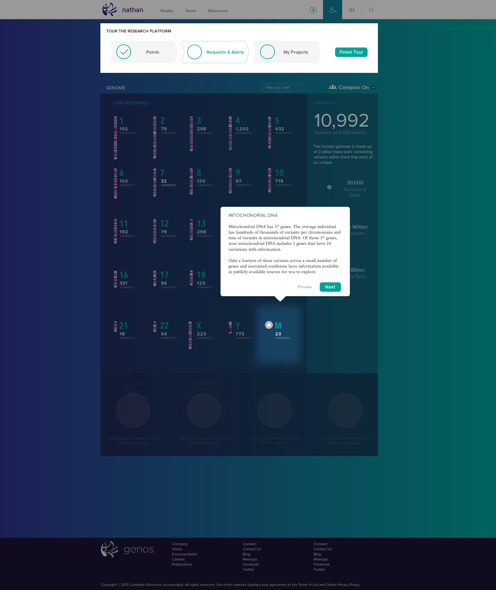
DESIGN SYSTEM
Over the course of the project Universal Mind worked with frog design to create a uniformed design language that stayed consistent and impactful across mediums including other websites and even the physical packaging of your sequencing kit.
From its bold and swooping gradients and visual elements, to its personal and impactful photography the goal of making complicated and potentially scary information accessible and consumable. The design was built to convey the trust and security that comes with a clinic, with the approachability that is expected as standard with high-end online experiences.
RESEARCH
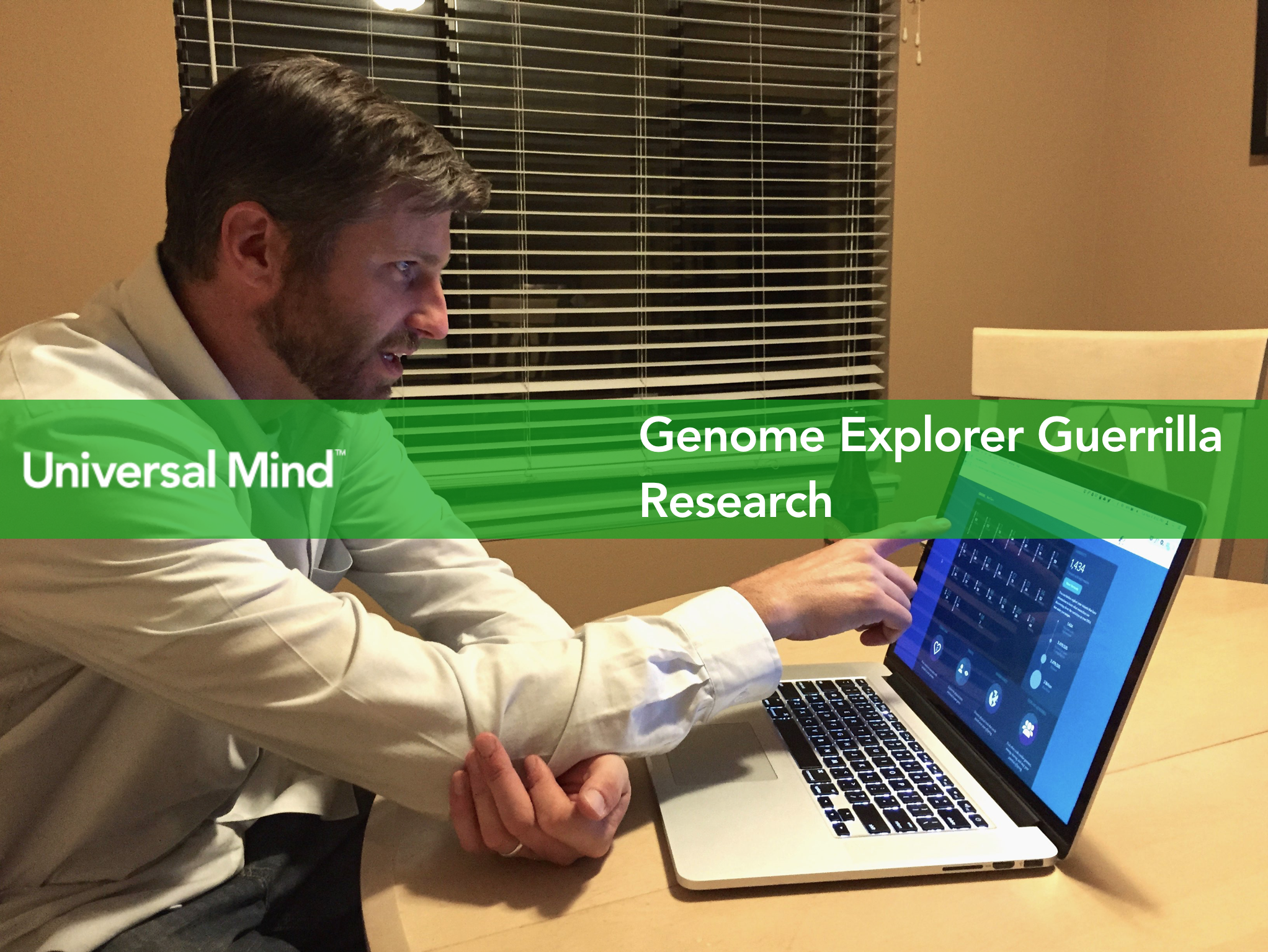
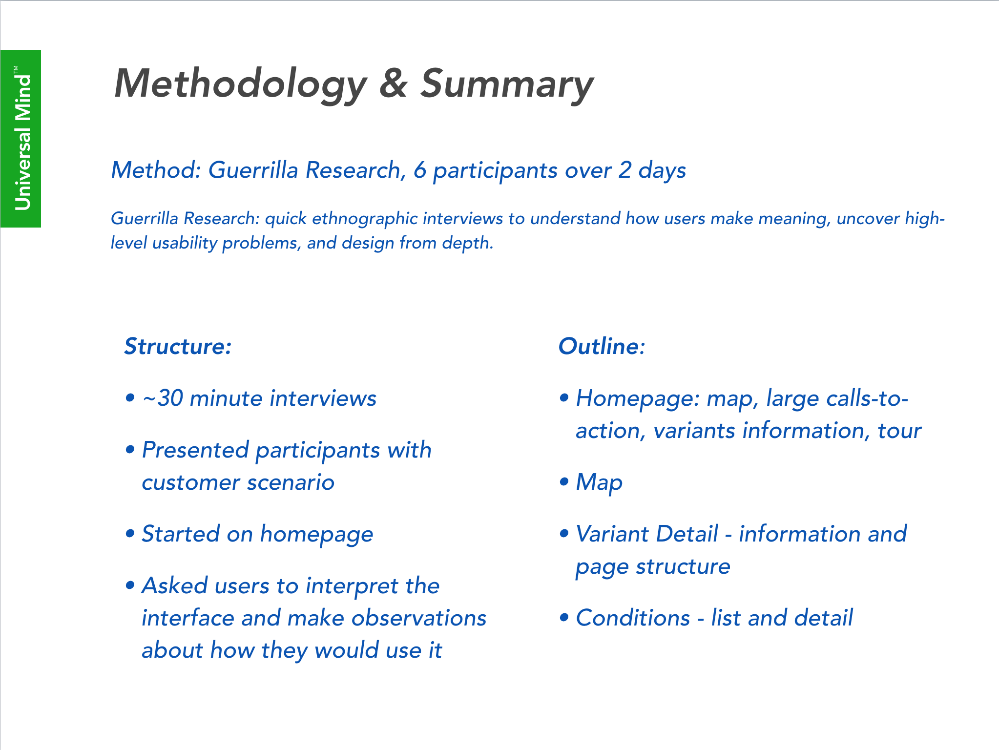
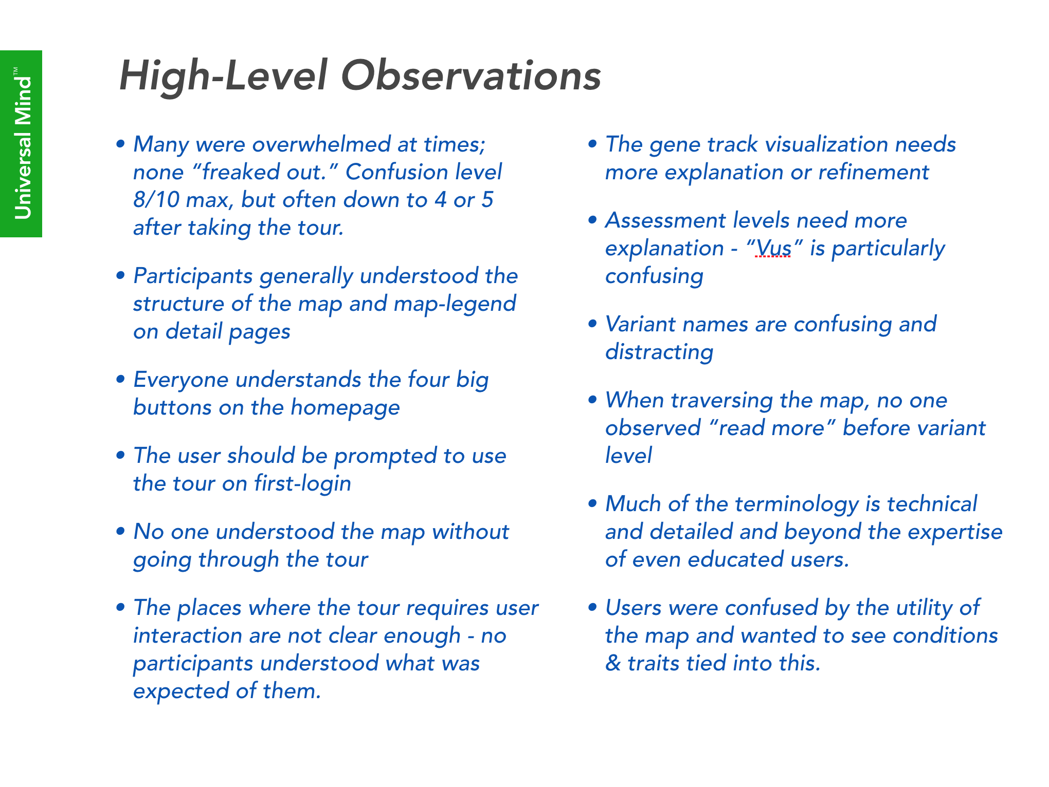
During the project we quickly ran into concerns that the subject material was far too complicated for an unguided trip through the app. We built out a quick tour through the app that walked through some of the key features of the interface. To test our hypothesis that the tour would be both beneficial and sufficient we conducted a quick guerrilla research study over a period of two days. Here a few slides from our findings are shown.
The study focused on having users talk through their understanding of the homepage, see if they could complete some simple tasks, and see if they ever found or even looked for the “start tour” button.
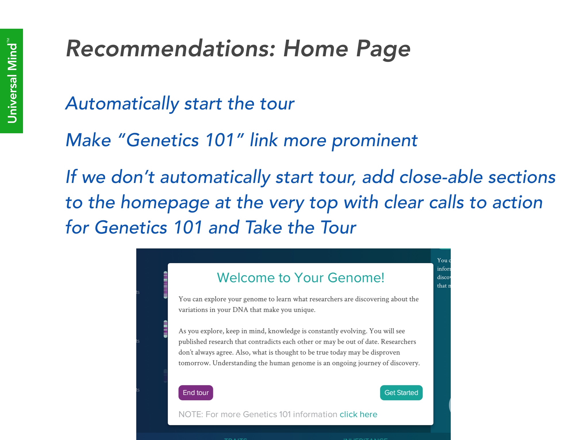
In the end we had many interesting findings. As for the tour, no one found it. We opted for the quick-fix of re-styling the top affordances and having the tour’s first welcome window launch automatically for first time users, and then animate back into its “start tour” state to indicate how it could be accessed again.
Utilizing our experience doing frequent quick research studies we were able to make small changes before problems got too large to fix.
ANCESTRY
While scientific information about how your genes work is important, most consumers are more concerned with how it impacts their bodies: physical traits, genetic conditions, and understanding their heritage.
We built a platform that is immediately useful but also scales as the scientific community unlocks more information about the human genome.
These areas also brought us face to face with the FDA and the regulations around making too strong of claims between the links of genetic data, and its correlated health risks.
How the project lives on
Universal Mind took this project from an idea living under Complete Genomics to a stand alone product with its own fundings, management, named Genos. In April 2017 NantOmics purchased Genos for its technical expertise, discovery/research tools, and data visualization.
To read our wired article visit https://www.wired.com/2016/12/genos-will-sequence-genes-help-sell-science/
